
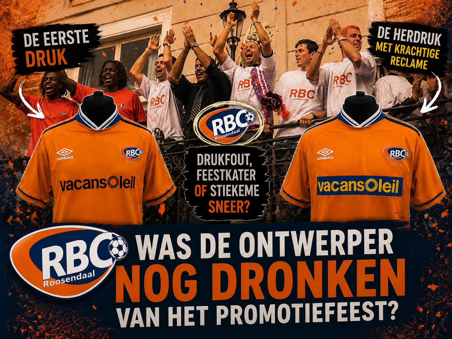
It is fairly well known amongst RBC supporters that the home shirt from the first Eredivisie season comes in two versions. The soft orange shirt with blue details and a large ‘Vacansoleil’ logo on the chest, initially in separate blue letters and later in a layout familiar to RBC fans, featuring a distinct (blue) bar around the letters, which have unfortunately now turned yellow.
As if the rebranding with which RBC entered the 21st century wasn’t enough – losing THE stadium (De Luiten), THE logo and almost the entire club identity. To top it all off, the – thankfully only temporary – new logo was also printed crookedly on the first batch of shirts. Is this a sign that the designers’ minds were still on the celebrations following the first promotion to the Eredivisie, simply a printing error, or a subtle dig at the higher-ups who forced the new logo through? We’ll leave that decision open. What was certain, however, is that Vacansoleil wasted no time and used the re-print of the shirts as an opportunity to make its logo even more visible.
Verder vanuit dit verhaal
Open de spelers, seizoenen, shirts en historische context die bij dit RBC-verhaal horen.
-
 Zelfde club en seizoen RBC Roosendaal 2000/2001 Home 1st version Short
Favoriet
Zelfde club en seizoen RBC Roosendaal 2000/2001 Home 1st version Short
Favoriet -
 Zelfde club en seizoen RBC Roosendaal 2000/2001 Home 2nd version Long
Favoriet
Zelfde club en seizoen RBC Roosendaal 2000/2001 Home 2nd version Long
Favoriet -
 Zelfde club en seizoen RBC Roosendaal 2000/2001 Home 2nd version Short
Favoriet
Zelfde club en seizoen RBC Roosendaal 2000/2001 Home 2nd version Short
Favoriet -
 TopstukZelfde club en seizoen RBC Roosendaal 2000/2001 Home Match-worn #11 Favoriet
 -
TopstukZelfde club en seizoen RBC Roosendaal 2000/2001 Home Match-worn #17 Favoriet
Gerelateerde verhalen

ReactiesKlik om zelf een reactie te plaatsen 0 ⌄
Log in met je Fred’s Footballshirts-account om een reactie te plaatsen.
InloggenNog geen openbare reacties.
